


Today, I have one more card to share that I created for one of my eye doctors. This card is for the retinal specialist. He was a great advocate in helping to find a surgeon to operate on my eye. I’m so very grateful!!!

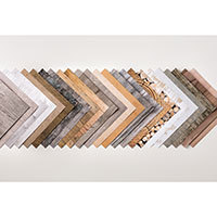
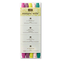
I just got my pre-order of new products from the 2018 Annual Catalog!!! It’s so exciting!!! Seriously, I think there’s nothing better than being inspired with new “toys.” Of all the new items, I was most excited to get my hands on ALL the new ink colors, including the Color Revamp and 2018 In Colors.
I LOVE color. There’s nothing more inspiring, and typically I spend a lot of time up-front planning colors combinations. I have an entire color combination board on Pinterest, and frequently save cards just because I love the colors!!! So a slew of new colors is like Christmas to me!
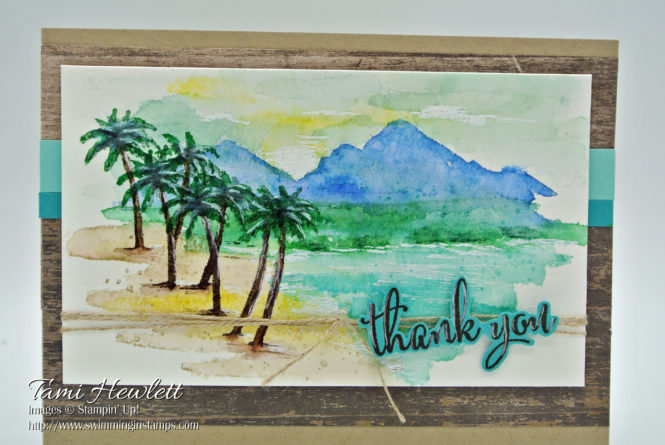
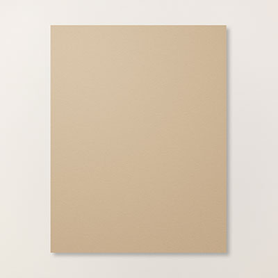
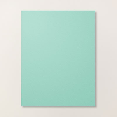
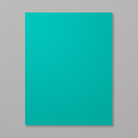
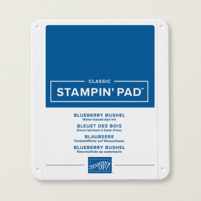
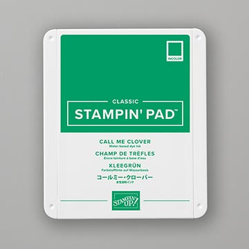
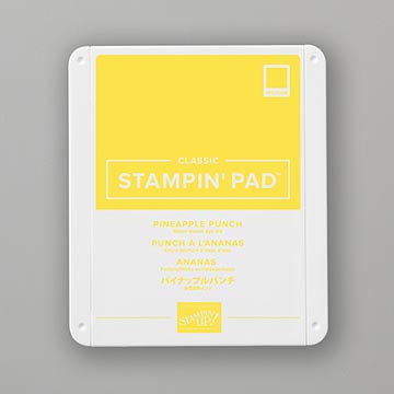
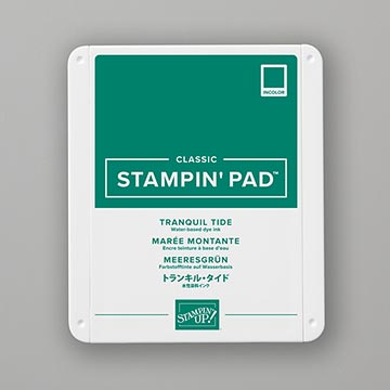
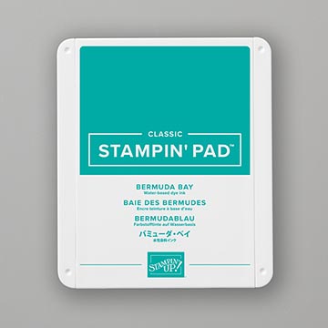
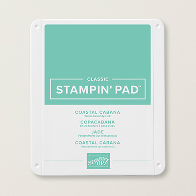
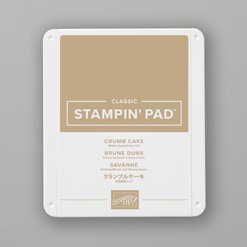
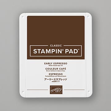
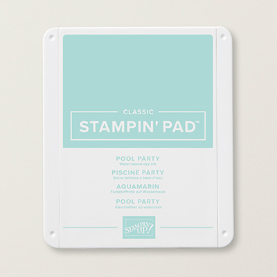
For this card, I needed to design a masculine card. So I went with green and blue tones and worked with some of the new 2018 In Colors, specifically Blueberry Bushel, Call Me Clover, and Pineapple Punch. The new In Colors are what I would call primary colors, and they pair very well with other brights, such as Costal Cabana and Bermuda Bay. On the other had, I didn’t want my card to look like a Kindergarten project, so I introduced some neutrals (Early Espresso and Crumb Cake), as well as a few other colors to tone things down (Pool Party and Tranquil Tide.)
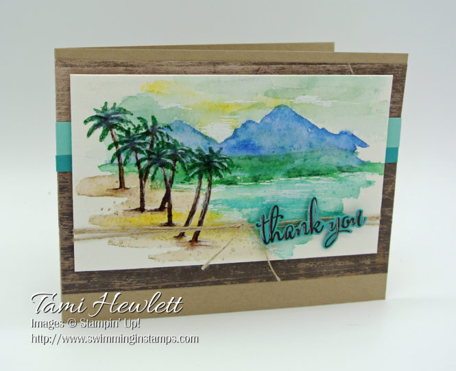
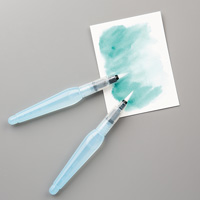
For the main scene, I used the Waterfront stamp set to stamp on watercolor paper. My favorite technique with this stamp set is to stamp and then go over the stamped image with an Aqua Painter to slightly blend the ink. This technique produces a look that appears painted.
I started with the mountains stamping off once for a lighter shade. Then, I added the hills, water, beach, and sky. This technique works best if you dry the paper in-between each color.
For the tree trunks, I lengthened the two nearest ones by only inking one tree trunk at a time and stacking one below the original stamped image. Then, I used two colors of green to stamp the palms and make them a little fuller.
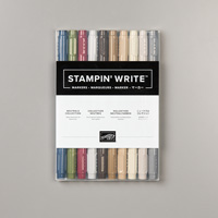
Additional tips: 1) Use your Aqua Painter to “ground” the trees by pulling a little color out into the sand. This also gives the appearance of a shadow. 2) Use a white gel pen and Tranquil Tide and Early Espresso Stampin’ Write Markers to add details to the palms, trunks, water, and sky. I even added white gel pen highlights to the sentiment. 3) Have a paper towel nearby to mop up messes. 4) Leave some white space. Don’t feel compelled to cover every speck of the paper. Watercoloring actually looks better with some unpainted areas. 5) For smaller areas, just ink up part of the stamp.
Supplied used on my card:


WOW!!! Stunning card!!
Ian i Thought those new colors were not for me…not my thing..
Thanks so much Holly❤