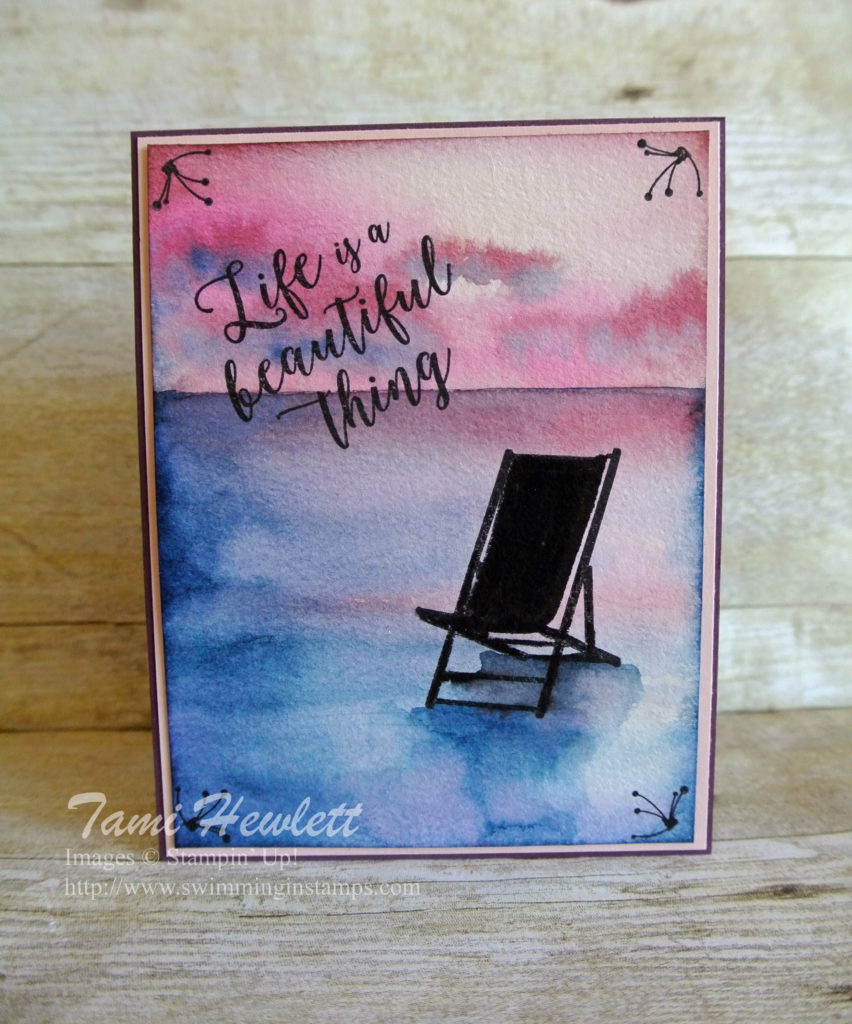
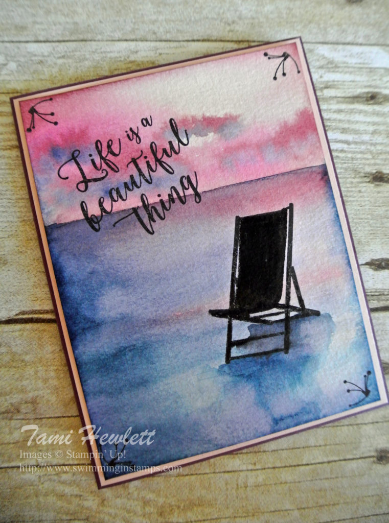
Life IS a beautiful thing. I love that saying, because it’s something I truly believe.
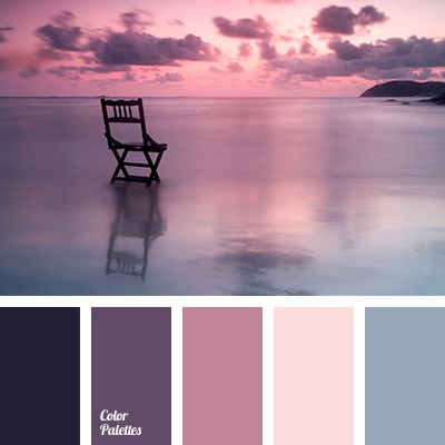
The other day, I was perusing Pinterest and found a gorgeous, tranquil photo that I wanted to copy. On the surface, it seems so simple … a beautiful sunset, water, and one chair. I decided to try to watercolor it.
Here’s the photo I found so you can see my inspiration. I had to change the orientation of the chair to go with my Colorful Seasons stamp set, but I really loved the colors and the shallow water, and the reflection.
I didn’t take photos of the process, because I didn’t have time. When I watercolor, I like to do it fast, so the paper stays wet and the colors blend. So, I’ll just have to make due with describing the process after the fact and providing a few tips.
I started with a piece of watercolor paper measuring 4″ x 5-1/4″. I did the majority of the painting freehand, but I knew I had to get the horizon perfectly straight, so I drew a faint line with a pencil.
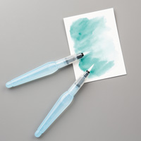
I did all the painting with Aqua Painters and ink pooled in the lid of my ink pads. (See colors listed below.) I painted the water first (from the horizon down.) I started by carefully painting across the horizon and covering the entire lower area with clear water. Then, I added Fresh Fig at the horizon and blended down. From there, I added the lighter colors first (Powder Pink) and then moved on to the darker colors (Berry Burst, Fresh Fig, and Night of Navy.)
Tips: If you want blended colors, you must add all the colors before the water dries. Otherwise, you’ll get watermarks in areas you may not want them. If an area dries too fast, you can add clear water over the entire area, but beware of doing this too much or you’ll overwork the paper.
Leave white space! It’s easy to add more color, but not so easy to take it away. If you do get in a situation where you want to take away some color, you can try adding clear water and mopping up with a paper towel.
I let the bottom half dry, especially the horizon line, before painting the sky. For the clouds, I painted some when the paper was wet, so the paint would blend. Then, I added darker color as the paper dried.
I ensured the paper was very dry before stamping the chair, sentiment and corners. I have to be honest that I didn’t do a great job stamping the chair. I “fixed” it with a Basic Black Stampin’ Write Marker.
My last steps included sponging the edges with Fresh Fig around the top and Night of Navy around the bottom, and painting the shadow under the chair. Some of my “fixing” blended a little, and I actually liked the way that turned out!
Supplies used on my card:




HI,
What did the original chair look like? Do you have a copy of the original picture? It’s so pretty.
Hi Ashley. Thanks so much! That is the original photo above that I used as inspiration. The chair is facing out to sea. The chair in the stamp set faces forward versus backwards, so that’s what I was trying to explain. Sorry for the confusion. ❤❤❤